How to Build a Nonprofit Brand Rooted in Story and Mission
Your logo is not your brand.
If you have spent any time in nonprofit leadership, you have probably heard that sentence. You may have even nodded along. But when the board starts talking about a “brand refresh,” the conversation almost always gravitates to the same place: a new logo, maybe some updated colors, a redesigned website. The assumption is that if the organization looks different, it will feel different.
It will not. Not unless the foundation is different.
Nonprofit branding is the total story your organization tells through everything it does and says: its words, its visuals, its donor communication, its website, its events, the way a staff member describes the ministry at a dinner party. The logo matters. The colors matter. But they are the final expression of something much deeper, and when organizations skip the deeper work, they end up with a pretty exterior built on an unclear foundation. People may notice the new look. They will not remember why they should care.
For Christian nonprofits and churches, this problem carries extra weight. You are not marketing a consumer product. You are representing a mission that reflects the work God is doing in the world. If your brand is muddled, inconsistent, or borrowed from someone else’s playbook, the story you are communicating is smaller than the story your ministry is actually living.
This guide walks through the complete nonprofit branding process we have developed over a decade of working with ministries. It moves in order, from the ground up, because the order matters. And the reason most ministry branding efforts fall short is that they start at the end.
Table of Contents
How Nonprofit Branding Builds Trust Before the First Conversation
People form impressions fast. Research on digital first impressions consistently shows that website visitors form credibility judgments in fractions of a second. Your brand is doing work long before your executive director picks up the phone.
This is not a marketing trick. It is how human beings process the world. We look for coherence. When we encounter a nonprofit with a clear visual identity, a website that communicates its mission in plain language, and consistent messaging across every touchpoint, we are more inclined to trust it. Not because we have studied design principles, but because coherence signals competence. And competence signals that this organization knows who it is and where it is going.
For ministry leaders, this matters practically. Donors, volunteers, and partner organizations are making decisions about your trustworthiness based on what they see and read before they meet you. A nonprofit brand strategy that prioritizes clarity and consistency does not replace the relational work of ministry. It creates the conditions where that relational work can begin.
Think about it from your donor’s perspective. There are thousands of ministries asking for their investment. Why would they choose yours over another organization offering similar services, sometimes in the same city? If your differentiators are not clear, you are asking people to guess. Most of them will not bother.
Why Most Ministry Branding Falls Apart at the Foundation
The most common nonprofit branding failure is not bad design. It is skipping the foundational work that design should be built on.
Here is the pattern we see repeatedly: A ministry decides it needs a brand refresh. A designer is hired to create a new logo. Colors are chosen, usually based on personal preference. A new website goes up. Within six months, the organization looks different but still cannot articulate what makes it distinct from the ministry down the street doing the same work.
This happens because branding for nonprofits requires layers of work that build on each other, and most organizations only invest in the visual layer. At its most basic level, every brand can be broken down into two components: words and visuals. The mistake is treating those as separate projects rather than interdependent ones.
The Apostle Paul used the image of a body to describe how different parts of the church work together, each distinct in function but forming one coherent whole (1 Corinthians 12:12-27, ESV). The same principle applies to your brand. Research, positioning, strategy, messaging, visual identity, and brand experience are not separate initiatives. They are interconnected elements that form one complete brand. A pretty logo cannot stand on its own any more than a hand can function apart from the arm.
Nonprofit Brand Strategy Starts with Identity, Not Audience Research
The conventional branding advice says to start with market research. Survey your donors. Study your competitors. Find out what your audience wants to hear, and build your brand around that.
For ministries, that advice gets the order wrong.
If you start by asking what the market thinks of you, you are building your brand on someone else’s perception. You are letting donor expectations, competitor positioning, and cultural trends define who your organization is. And the result, almost inevitably, is a brand that shifts with the wind, because it was never anchored to anything deeper than audience preference.
The better starting point is identity. Not the identity you wish you had or the identity a consultant invents for you. The identity God has already given your organization.
Every ministry exists because God called someone to a specific work among specific people. That calling, those convictions, that theology of mission and service is the foundation your brand should be built on. Before you study what your donors think, you need to be able to say clearly: This is who we are. This is what we believe. This is who God has called us to be.
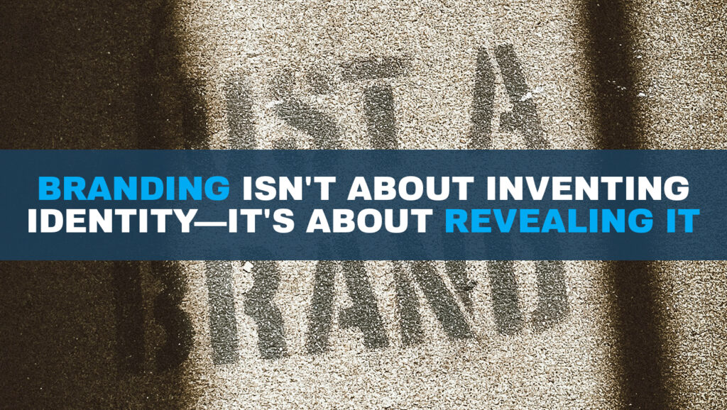
This is not a soft or sentimental distinction. It changes the entire trajectory of the branding process. When identity comes first, your positioning, messaging, and visual design all serve as expressions of something that already exists. You are not inventing a brand. You are revealing one. When market research comes first, you risk building a brand that looks appealing but does not actually reflect your organization’s convictions or calling. And that gap between image and reality is exactly where donor trust breaks down.
We have written more extensively about this theology of branding as revelation rather than invention. It is one of the convictions that shapes every brand we build.
This does not mean audience understanding is irrelevant. Once you know who you are, understanding your audience helps you communicate that identity with clarity. Knowing who your donors are, what motivates their generosity, and where they go for information helps you speak your truth in language they can receive. But the identity itself is not market-derived. The audience shapes how you say it. God shapes what you say.
Brand Positioning: Claiming Your Place with Clarity
All the research you have gathered leads to this step: defining the specific, differentiated place in the market your ministry will occupy.
Brand positioning is the answer to the question: When someone asks what your organization does, what do you want them to understand in the first fifteen seconds?
Consider how large brands handle this. BMW does not just sell cars. BMW has positioned itself in a specific corner of the automotive market where engineering precision and driving experience define the brand. Every decision BMW makes in advertising, product development, and customer experience reinforces that position. Ministry brands need the same clarity, scaled to their own context.
Your nonprofit brand positioning should articulate who you serve, the specific problem you address, and why your approach is distinct from other organizations addressing similar needs. For a faith-based nonprofit, this also includes the theological convictions that shape your method. If you cannot state your position in two or three clear sentences, no amount of design work will compensate.
Brand Messaging: The Words That Carry Your Mission
Once you know your position, you need the words to express it. This is the messaging layer, and it is where most nonprofits are weakest.
Brand messaging is not a mission statement drafted in a strategic planning retreat and then filed away. It is the living language your organization uses at every touchpoint: your website, your donor letters, your social media captions, the way your staff describes the ministry when someone asks at church. Effective messaging is consistent, clear, and compelling whether it appears in a formal case for support or a casual conversation.

Several building blocks make up your brand messaging framework. Your brand positioning is the foundation, the place in the market you have defined. Your mission statement is a practical explanation of what your organization does. Your brand pillars are the core values on which your ministry is built. Together, these create your brand personality and voice, and they should all be driven by the story you want to tell.
In an era when attention spans are short and competition for donor interest is high, efficiency in messaging matters. You need to be able to explain what your ministry does and why it matters quickly and clearly. All of the upstream work, the research, positioning, and strategy, comes together in this phase to inform the language that will represent your organization everywhere it shows up.
Find your story. Identify why it is different from every other ministry doing similar work, even in the same city. That distinction will drive your messaging. And once your messaging is clear, it becomes the blueprint for everything visual that follows.
Visual Identity: Your Ministry’s First Impression
Now we get to the part most people think of when they hear the word “brand.” Visual identity is the collection of design elements that represent your ministry visually: your logo, your color palette, your typography, the style of photography and imagery you use.

Visual identity matters. It is your first impression. It creates recognition. And when done well, it communicates at an emotional level that words alone cannot reach. But visual identity must be built on the foundation of your positioning, strategy, and messaging. Otherwise, it is decoration without meaning.
At Reliant Creative, we define brand identity as who your organization is visually, and it must always be consistent. The visual aspects of your brand are arguably where consistency matters most, because visual inconsistency is the thing people notice fastest. When every piece of communication, from your website to your business cards to your event banners, speaks the same visual language, you build recognition. Recognition builds loyalty. And loyalty, over time, builds advocacy.
Logo Design for Nonprofits: Rules That Serve the Mission
Your ministry’s logo is the mark by which your audience remembers you visually. It deserves careful thought, but it is still just one piece of a much larger system.
There are several practical rules worth following when designing or evaluating a nonprofit logo. The logo should work well monochromatically, meaning it must be as strong in black, gray, or white as it is in full color. The logo must be strong when displayed flat; even if it has dimensional elements, the flat version needs to hold up. The logo must be scalable, working at any size from a favicon to a banner. And the logo should be timeless, designed to outlast trends.
These are not arbitrary preferences. They are functional requirements. Your logo will appear on screens, on print materials, on merchandise, on signage, and in contexts you cannot predict. A logo that fails any of these tests will create problems downstream.
Color Palette: Choosing with Purpose, Not Preference
Color is one of the most underrated elements in nonprofit branding. Most ministries choose colors based on personal taste, which is a missed opportunity.
Colors carry psychological associations. Research on color psychology consistently shows that different colors evoke different emotional responses in viewers. As a ministry trying to grow your reach and deepen your impact, it is wise to make color choices informed by research rather than preference alone.

Your ministry will never own a color the way Coca-Cola owns red. But you can consistently associate your brand with a specific palette, and over time that association becomes powerful. In fact, color is often the most enduring element of any brand. Logos and typography choices may evolve every few years, but color associations become so embedded in audience perception that changing them can damage recognition.
When building your nonprofit brand guidelines, define your color palette with exact color codes. Every designer, printer, and web developer who touches your brand should be working from the same values. Consistency in color reinforces trust. Inconsistency, even subtle inconsistency, creates an unnamed sense that something is off.
Typography: The Bridge Between Words and Visuals
If color is underrated in nonprofit branding, typography is even more so. It is the visual element that carries your words to the reader, which makes it the bridge between your messaging and your visual identity.
Fonts generally fall into two broad categories. Serif fonts have small decorative features at the ends of letter strokes and tend to communicate formality, tradition, and credibility. Sans-serif fonts, without those features, tend to feel cleaner, more modern, and more approachable. These are generalizations, not rules. But they are useful starting points.

When selecting typography for your nonprofit brand, several considerations matter. Your fonts need to be readable across all contexts, from web to print to mobile. If you are using multiple fonts, they need to pair well together. And your typography choices need to be consistent everywhere your brand appears. A headline font that changes from your website to your annual report to your email newsletter creates the same kind of fragmentation that inconsistent color does.
Typography may seem like a small detail. It is not. It is the element your audience interacts with most frequently, even if they never consciously notice it. The right type choices reinforce professionalism, clarity, and trust. The wrong ones, or inconsistent ones, quietly undermine everything else you have built.
Brand Experience: Where Everything Comes Together
The brand experience is the sum total of every interaction someone has with your organization. It includes your website, your social media, your events, your email communication, your printed materials, the way your receptionist answers the phone, the follow-up a donor receives after their first gift. This is where branding for nonprofits becomes most practical and most challenging.
You can have the best story in the world and the best logo in the world, but if your supporter’s experience with your brand is lacking, or worse, negative, your ministry will struggle. A great brand experience must be consistent across every touchpoint. It is this consistency that turns a first-time donor into a recurring partner, and a recurring partner into an advocate who tells your story to friends, family, and colleagues without being asked.
Brand advocacy is the ultimate goal of nonprofit branding. It is what happens when a supporter’s experience with your organization is so consistently positive and so clearly connected to something meaningful that they cannot help but tell others about it. For ministries, this carries even more potential than it does for consumer brands. A donor who is personally invested in a ministry that rescues women from trafficking, or feeds children in poverty, or plants churches in unreached communities, already has a story worth telling. The question is whether your brand has equipped them with the clarity to tell it well.
Nonprofit Brand Guidelines: The Document That Protects Your Investment
All of this work, the research, positioning, messaging, visual identity, and brand experience decisions, needs to live somewhere accessible to every person who creates content or communication on behalf of your organization.
That document is your brand guidelines. It should include logo usage rules (size minimums, clear space requirements, monochrome versions), your color palette with exact codes, typography standards for headlines, body text, and captions, your brand voice description with examples across different contexts, and photography style direction.
For faith-based nonprofits, brand guidelines should also address how Scripture is cited, how theological language is used in public-facing materials, and the tone that reflects your convictions without alienating broader audiences.
The purpose of nonprofit brand guidelines is not to restrict creativity. It is to create a container within which creativity serves your mission rather than fragments it. The best guidelines are short enough to read in one sitting and specific enough that a new team member could create an on-brand email without asking five questions.
For churches navigating similar questions, we have written separately about branding for churches and the unique dynamics of congregational identity.
Nonprofit Branding FAQs
What is nonprofit branding and why does it matter for faith-based organizations?
Nonprofit branding is the total impression your organization creates through its visual identity, messaging, voice, and every point of contact with your audience. For faith-based organizations, branding carries additional weight because it represents not only your cause but the theological convictions shaping your work. A clear brand builds trust with donors and partners before you ever have a conversation with them.
What should be included in nonprofit brand guidelines?
Effective nonprofit brand guidelines include logo usage rules with size and spacing requirements, your full color palette with exact color codes, typography standards for all contexts, brand voice descriptions with examples for different channels, and photography or imagery style direction. Faith-based organizations should also include guidance on Scripture citation and the use of theological language in public materials.
What is the difference between brand identity and brand experience?
Brand identity refers specifically to the visual elements of your brand: logo, color palette, typography, and design language. Brand experience is broader. It encompasses every interaction someone has with your organization, from your website and social media to your events, donor communication, and staff interactions. A strong brand identity contributes to a strong brand experience, but identity alone is not enough.
How much does nonprofit branding cost?
Costs vary depending on scope. A messaging and positioning project may range from a few thousand dollars to significantly more for a comprehensive engagement that includes research, strategy, messaging, visual identity, and brand guidelines. The most important consideration is not the dollar figure but whether the investment addresses the foundational layers of positioning and messaging rather than jumping directly to visual design.
Can a small nonprofit with a limited budget improve its branding?
Start with messaging. Clarity of mission and consistency of voice cost nothing but time and honest conversation. Audit your current materials for inconsistencies. Write a one-page brand voice guide your team can follow. Choose a few visual elements to standardize across all platforms. These steps create real improvement before any design work begins.
What is the biggest nonprofit branding mistake you see in ministry organizations?
Treating the logo as the brand. Most ministries invest in a new visual identity without doing the foundational work of positioning and messaging. The result is an organization that looks different but still cannot clearly explain what makes it distinct. The brand development process should move in order: research, positioning, messaging, and then visual identity. When that order is reversed, the investment rarely holds.
When to Rebuild and Where to Start
If your organization recognizes itself in this guide, the path forward does not require starting from scratch. It requires honesty about which layers are solid and which are missing.
Start with an audit. Look at your website, your last ten social media posts, your most recent donor letter, and your event materials. Do they tell the same story? Do they use the same visual language? Would a new visitor understand what your organization does and why it matters within thirty seconds?
Then move to positioning. Gather your team and ask: What makes this ministry distinct? Not just what you do, but why you do it differently, and why that difference matters to the people you serve. If the room gives five different answers, that is your starting point.
From positioning, build your messaging. Write your story clearly enough that any board member could tell it without notes. Then build your visual identity on that foundation: logo, color, typography, photography style, all documented in brand guidelines your whole team can follow.
This is not a six-week project. It is a sustained investment in the clarity of your witness. “Whatever you do, work heartily, as for the Lord and not for men” (Colossians 3:23, ESV). That includes the communication work. A clear, honest, consistent brand honors the mission God has given your organization and equips the people around you to carry that story forward.
Reliant Creative is a Christian marketing agency that partners with churches and nonprofits to build brands rooted in story and mission. If your nonprofit’s brand is not carrying the weight of your mission, we would welcome the chance to help you build one that does. Explore our Brand Development services.